Bangkok
คุนส์ฮาเลอ
คุนส์ฮาเลอ
ABCDEFGHIJKLMNOPQRSTUVWXYZ
abcdefghijklmnopqrstuvwxyz
0123456789
กขฃคฅฆงจฉชซฌญฎฏฐฑฒณดตถทธน
บปผฝพฟภมยรลวศษสหฬอฮ
๐๑๒๓๔๕๖๗๘๙
@&.,:;…!¡?¿·•*#//-–—_
(){}[]‚„“”‘’‛«»‹›"'
abcdefghijklmnopqrstuvwxyz
0123456789
กขฃคฅฆงจฉชซฌญฎฏฐฑฒณดตถทธน
บปผฝพฟภมยรลวศษสหฬอฮ
๐๑๒๓๔๕๖๗๘๙
@&.,:;…!¡?¿·•*#//-–—_
(){}[]‚„“”‘’‛«»‹›"'
Variable
ไทยวัฒนาพานิชก่อตั้งขึ้นเมื่อปี พ.ศ. 2478 ในฐานะสำนักพิมพ์ตำราเรียน
Regular
The institution prides itself in its experimental nature.
Medium
บางกอก คุนส์ฮาเลอ มุ่งมั่นที่จะเป็นศูนย์กลางแห่งการแลกเปลี่ยนความคิด
Bold
The site straddles the border of "old" and "new" Bangkok
Client
Bangkok Kunsthalle
Manufacturer
Stawix Foundry
Designer
Stawix Ruecha
Year
2024
Styles
4 Styles
Forestype: Typographic Architecture at the Intersection of Eras
For the Bangkok Kunsthalle project, we sought more than mere display faces; we aimed for a typographic language capable of articulating the brutalist industrialism of the past alongside the experimental ethos of the present. The result is Forestype, a custom type system crafted to function as the core architectural structure of the institution’s visual identity.
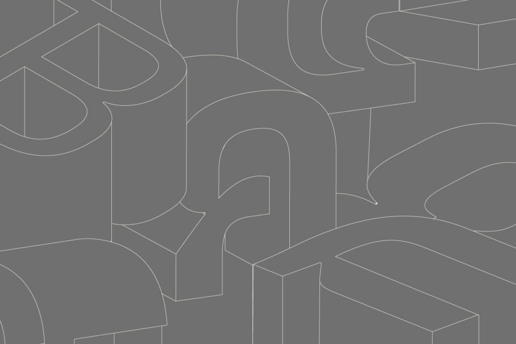
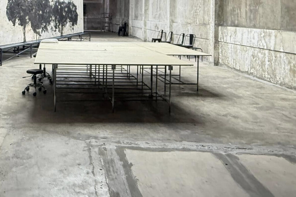
Housed in the former Thai Wattana Panich printing house (est. 1935), the Bangkok Kunsthalle is a site defined by its history. We extracted the building’s brutalist DNA and translated it into a robust, high-contrast skeletal structure. This design isn’t an exercise in nostalgia; it is an homage to the site’s heritage as a "factory of knowledge," reimagined as a bespoke typographic asset.
The primary challenge lay in balancing the semi-serif construction. We aimed for a tension between uncompromising precision and organic fluidity. The restrained, subtle serif terminals act as optical pauses, tempering the structure’s monolithic brutality. This hybrid approach bridges the gap between classic legibility and contemporary experimentalism, ensuring the face maintains a sophisticated, architectural silhouette across all collateral.
For the Bangkok Kunsthalle project, we sought more than mere display faces; we aimed for a typographic language capable of articulating the brutalist industrialism of the past alongside the experimental ethos of the present. The result is Forestype, a custom type system crafted to function as the core architectural structure of the institution’s visual identity.
Housed in the former Thai Wattana Panich printing house (est. 1935), the Bangkok Kunsthalle is a site defined by its history. We extracted the building’s brutalist DNA and translated it into a robust, high-contrast skeletal structure. This design isn’t an exercise in nostalgia; it is an homage to the site’s heritage as a "factory of knowledge," reimagined as a bespoke typographic asset.
The primary challenge lay in balancing the semi-serif construction. We aimed for a tension between uncompromising precision and organic fluidity. The restrained, subtle serif terminals act as optical pauses, tempering the structure’s monolithic brutality. This hybrid approach bridges the gap between classic legibility and contemporary experimentalism, ensuring the face maintains a sophisticated, architectural silhouette across all collateral.
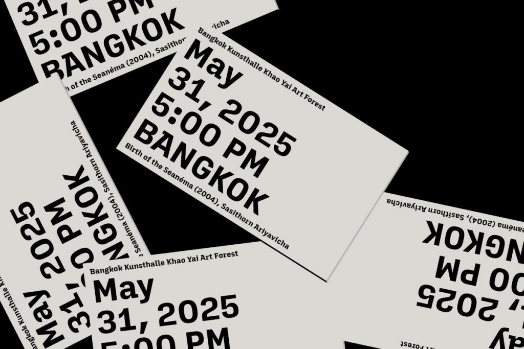
From an engineering standpoint, our priority was achieving superior rasterization and cross-platform performance. We meticulously tuned the proportions between the Thai script and Latin characters, ensuring a coherent rhythm and balanced visual weight. By refining the hinting and character set mapping, we’ve ensured that Forestype delivers high legibility and an distinct identity, whether rendered at massive scales on gallery walls or at smaller point sizes on digital interfaces.
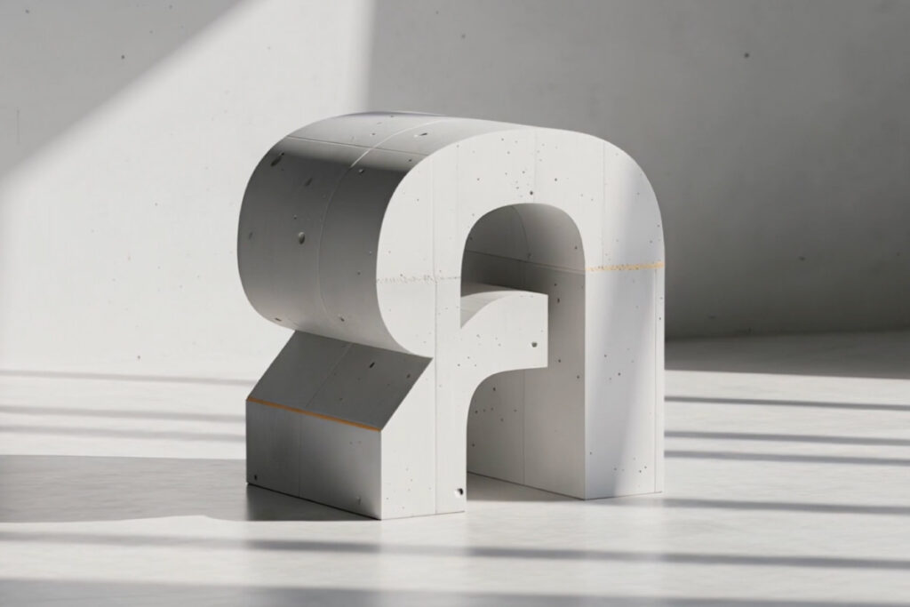
Drawing from the institution’s symbolic link to the "Khao Yai Art Forest," the type’s rhythm echoes organic expansion—a literal symbiosis of urban and nature. Certain strokes possess a subtle, tapered grace, mimicking roots fracturing through concrete. This organic undercurrent ensures the system isn't merely functional, but alive.
Forestype is a highly flexible, living system. Designed for the rigorous demands of multi-disciplinary programming—ranging from cinema to complex curatorial exhibitions—it functions as a responsive voice. It is more than a typeface; it is a definitive marker of an institution that bridges the gap between historical weight and future-forward experimentation.