Don't .. มายด์
ABCDEFGHIJKLMNOPQRSTUVWXYZ
abcdefghijklmnopqrstuvwxyz
0123456789
กขฃคฅฆงจฉชซฌญฎฏฐฑฒณดตถทธน
บปผฝพฟภมยรลวศษสหฬอฮ
๐๑๒๓๔๕๖๗๘๙
@&.,:;…!¡?¿·•*#//-–—_
(){}[]‚„“”‘’‛«»‹›"'
abcdefghijklmnopqrstuvwxyz
0123456789
กขฃคฅฆงจฉชซฌญฎฏฐฑฒณดตถทธน
บปผฝพฟภมยรลวศษสหฬอฮ
๐๑๒๓๔๕๖๗๘๙
@&.,:;…!¡?¿·•*#//-–—_
(){}[]‚„“”‘’‛«»‹›"'
Variable
โซลูชันบ้านอัจฉริยะ แบรนด์ใหม่โดย SCG
Thin
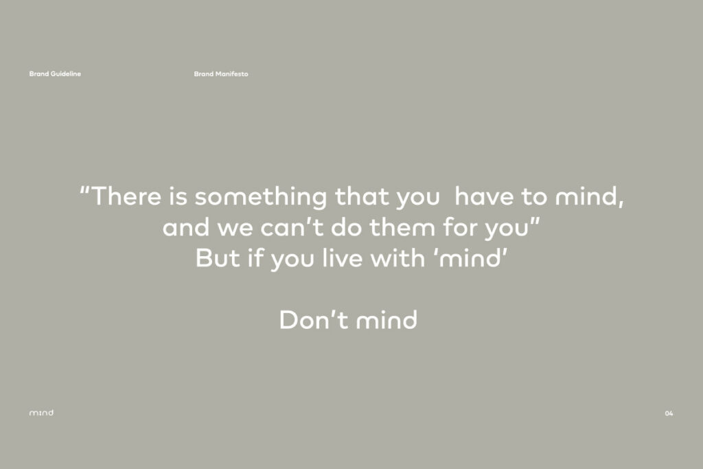
please mind your life, don't mind the technology.
ExtraLight
เลือกเข้าถึงสภาพแวดล้อมที่เป็นมิตรเพื่อคุณภาพชีวิตของคุณและคนที่ห่วงใย
Light
not a brand but a starting point of Thailand's smart home ecosystem
Regular
ใช้ชีวิตได้ไร้ขีดจำกัด แต่ยังคงประหยัดทุกค่าใช้จ่าย
Medium
When creativity meets innovative technology.
SemiBold
ดูแลสิ่งสำคัญในชีวิต ทั้งคนใกล้ชิด และสิ่งของรอบกาย
Bold
Driving the new economy featuring designers and innovators
Heavy
เพราะทุกวันของชีวิติคนเรามีเรื่องให้ mind เยอะ
Black
THE SOMMELIER OF SMART LIVING SOLUTION

Client
SCG / Mind
Manufacturer
GREYGRAM CO.
Designer
Stawix Ruecha
Year
2023
Styles
10 Styles
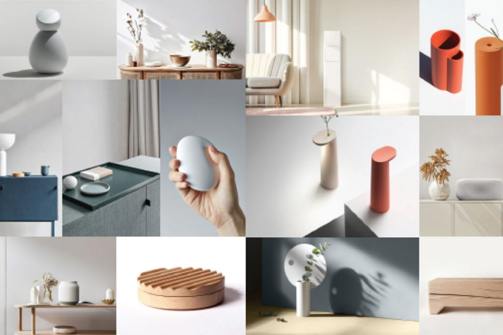
In 2023, Mind developed Mind Sans as part of a broader effort to define and strengthen its brand identity. The typeface was not created simply to give the company a proprietary font. It was designed to express what Mind stands for: a smart living brand that is inclusive, approachable, humble, and reliable.
That positioning matters. Mind does not present itself as a brand that sells technology for its own sake. Its brand story is centered on people, daily life, and the idea that smart living should make life easier rather than more complicated. The guideline describes Mind as a brand that helps people live comfortably and confidently, without having to “mind” the technology itself. In that context, typography becomes more than a visual system. It becomes a voice.
Mind Sans was developed as the further essence of the brand identity. Its design is heavily inspired by the logotype, creating a close visual relationship between the wordmark and the type system. That connection gives the brand a sense of continuity: the logo does not sit apart from the rest of the identity, but extends into the everyday language of the brand. The result is a typeface that feels like part of the same family as the logo rather than a separate design decision.
The typeface is shaped by a balance of qualities that reflect Mind’s character. It is rounded enough to feel warm and human, but restrained enough to remain credible. It is friendly without becoming casual, and intelligent without becoming intimidating. In the brand guideline, Mind is described through ideas such as “wise & charming,” “humble & inclusive,” and “accessible & approachable.” Mind Sans translates those ideas into letterforms. It is a typeface that is meant to feel welcoming at first glance and trustworthy over time.
This is also why the brand puts such emphasis on simplicity. Mind Sans comes in nine weights, but the guideline recommends using only four for most applications. That is a deliberate choice. For a brand built around ease and accessibility, the typographic system should not feel overloaded. It should be clear, flexible, and easy to use. In other words, the typography should support the brand’s promise of a hassle-free experience.
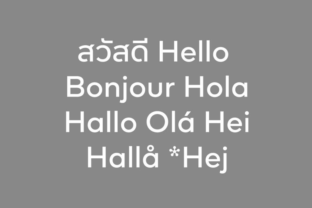
Another important part of the system is language support. The brandbook notes that additional glyphs were added to support Scandinavian languages beyond Latin1. That detail suggests that Mind Sans was designed as a practical identity asset, not just a visual concept. It was built with broader use in mind, which reinforces the brand’s own values of accessibility and compatibility.
What makes Mind Sans especially interesting is that it does more than improve readability. It helps shape perception immediately. The brand does not want to look like a company speaking in technical jargon or showing off expertise. It wants to look knowledgeable, but humble. Reliable, but not rigid. Friendly, but not generic. Mind Sans supports that position by making the brand feel easy to approach and easy to understand.
That is the real role of the custom font here. It is not decoration. It is not just a branded typeface. It is a system for turning Mind’s philosophy into something people can see, read, and feel instantly. The typography helps the brand communicate one central idea: smart living should be accessible, calm, and human.